Alaska Fertilizer Rebrand
LEAD DESIGNER
Brand Strategy
Packaging Design
Visual Identity (Re)Design
Copywriting
ROLES
Fertilizer with fins!
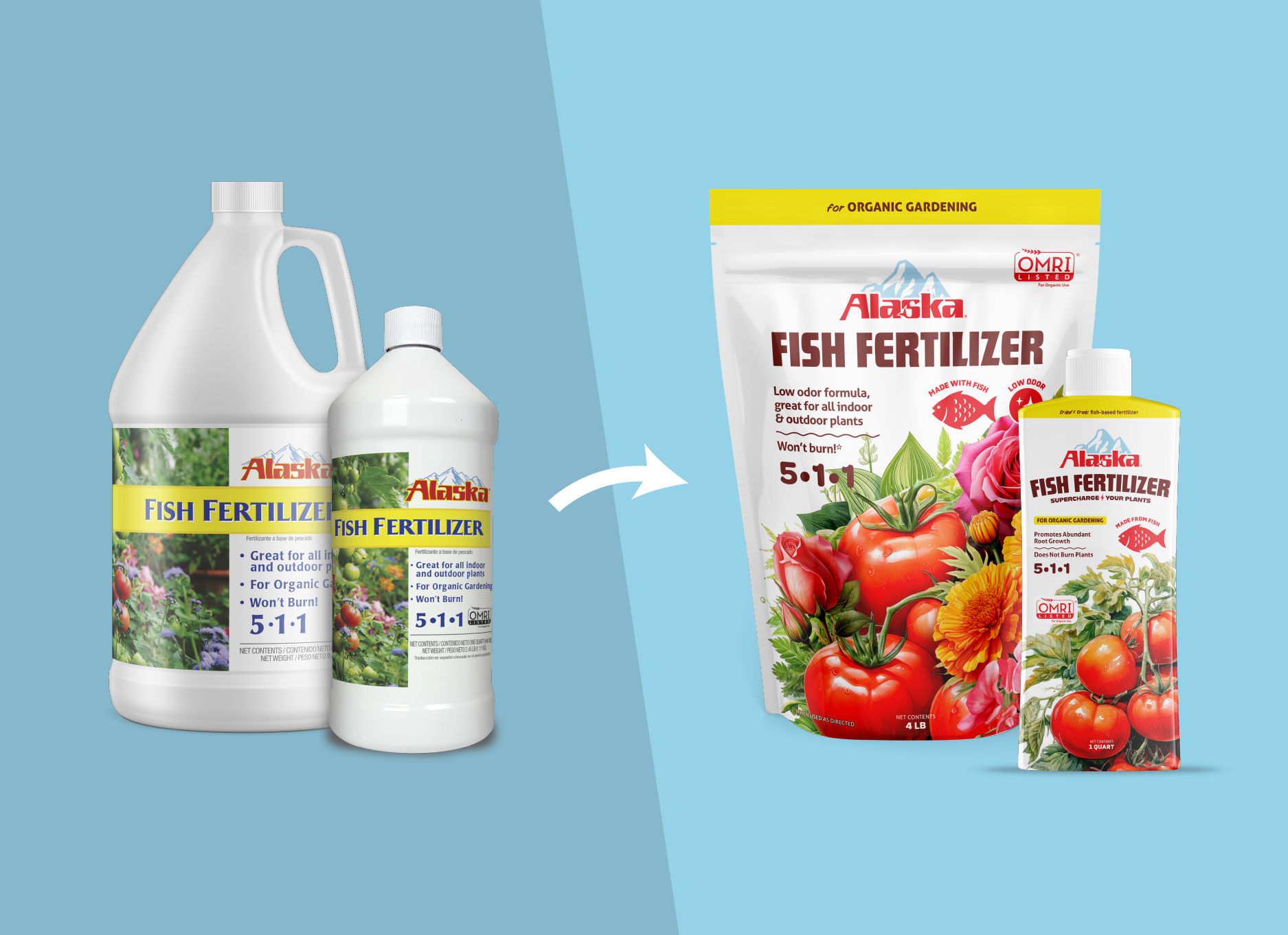
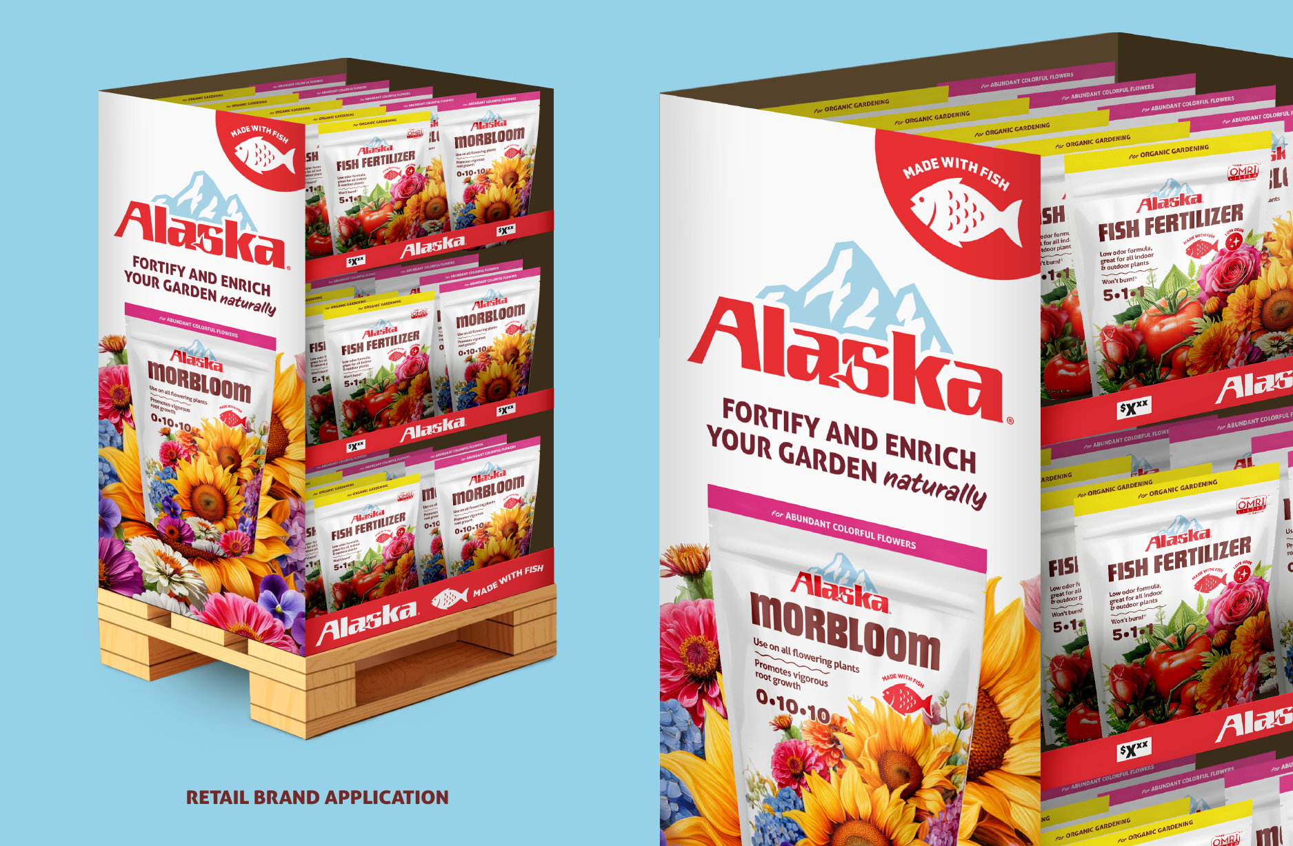
Alaska is an established brand in the fertilizer industry, so when Central decided to give the packaging and visual branding a much needed update, it was an exercise in balancing brand equity with modern sensibility. And of course, crucial claims to incorporate into the brand messaging and packaging. We also saw a clear opportunity to improve how we were using our label real estate.
While digging into gardening blogs, Reddit posts, and other research, I kept encountering surprise and delight from consumers around how well fish fertilizer works. As a result, I decided to spotlight how dramatically effective the product is so we could capture new segments of the market who were unaware of this efficacy. To drive the point visually, I prioritized using the juiciest, most attention-grabbing produce imagery possible at a large scale on each concept.
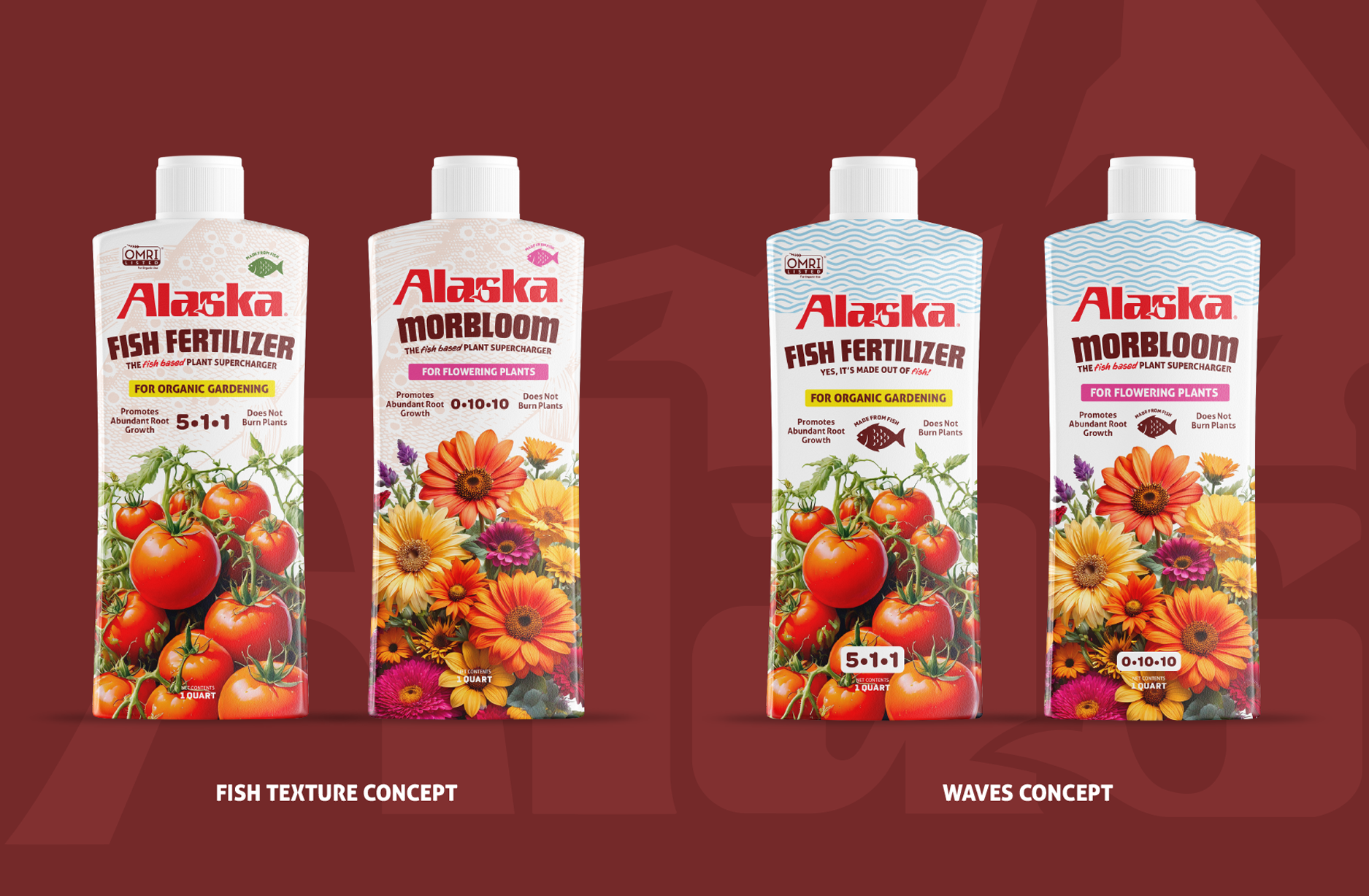
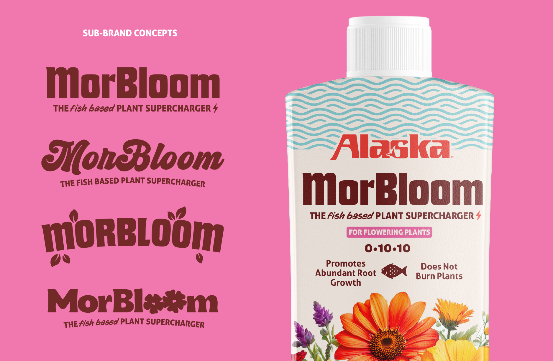
I also explored different ways to communicate the unique fact that fish is THE ingredient here. Because this point was so important, I opted to work in a pretty obvious detail of fish tail in the logo. Subtle fish scale textures, wave elements, and snappy bits of copy about our star ingredient were explored as well.
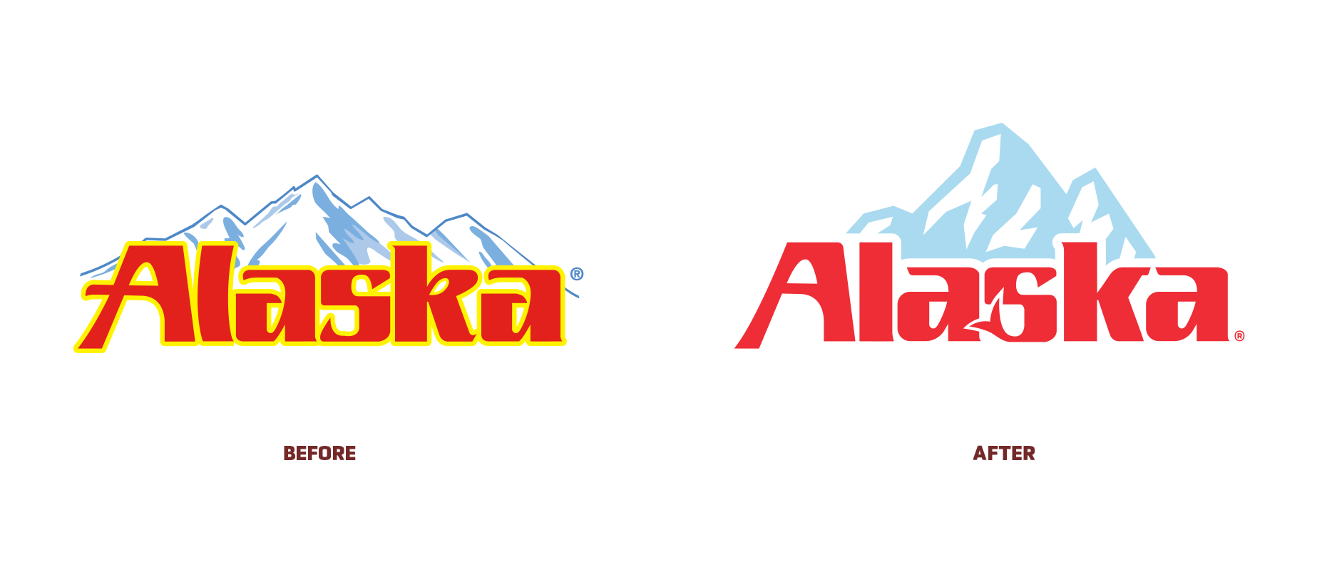
Speaking of the logo, this was where equity came into play in a big way. Our brand team wanted to keep the mountains, a close-in color pallet, and the same typography. I worked to keep these elements intact while also cleaning, streamlining, and making the logo more visually appealing with type modifications and a new mountain range.